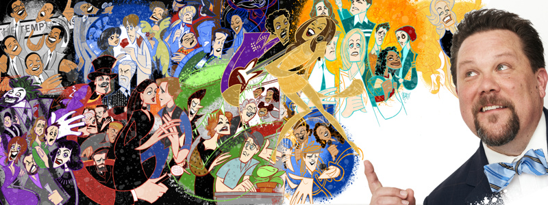
Squigs Picks His 10 Favorite Broadway.com Illustrations of the Past Decade
Howdy, folks! Justin Robertson, a.k.a. Squigs, here! December 29 will mark the 10th anniversary of my very first Broadway.com illustration. Plus Tony night 2020 will mark the decennial of our regular Broadway Ink feature. It’s astounding to think that my collaboration with Broadway.com is still going strong. To celebrate, I’ve been asked to choose 10 favorites from the nearly 500 illustrations I’ve created. It’s a daunting task. But I think these choices fall at the crossroads between the overall quality of the artwork and how accurately I feel my piece captured the art on stage. Here’s a walk down memory lane.
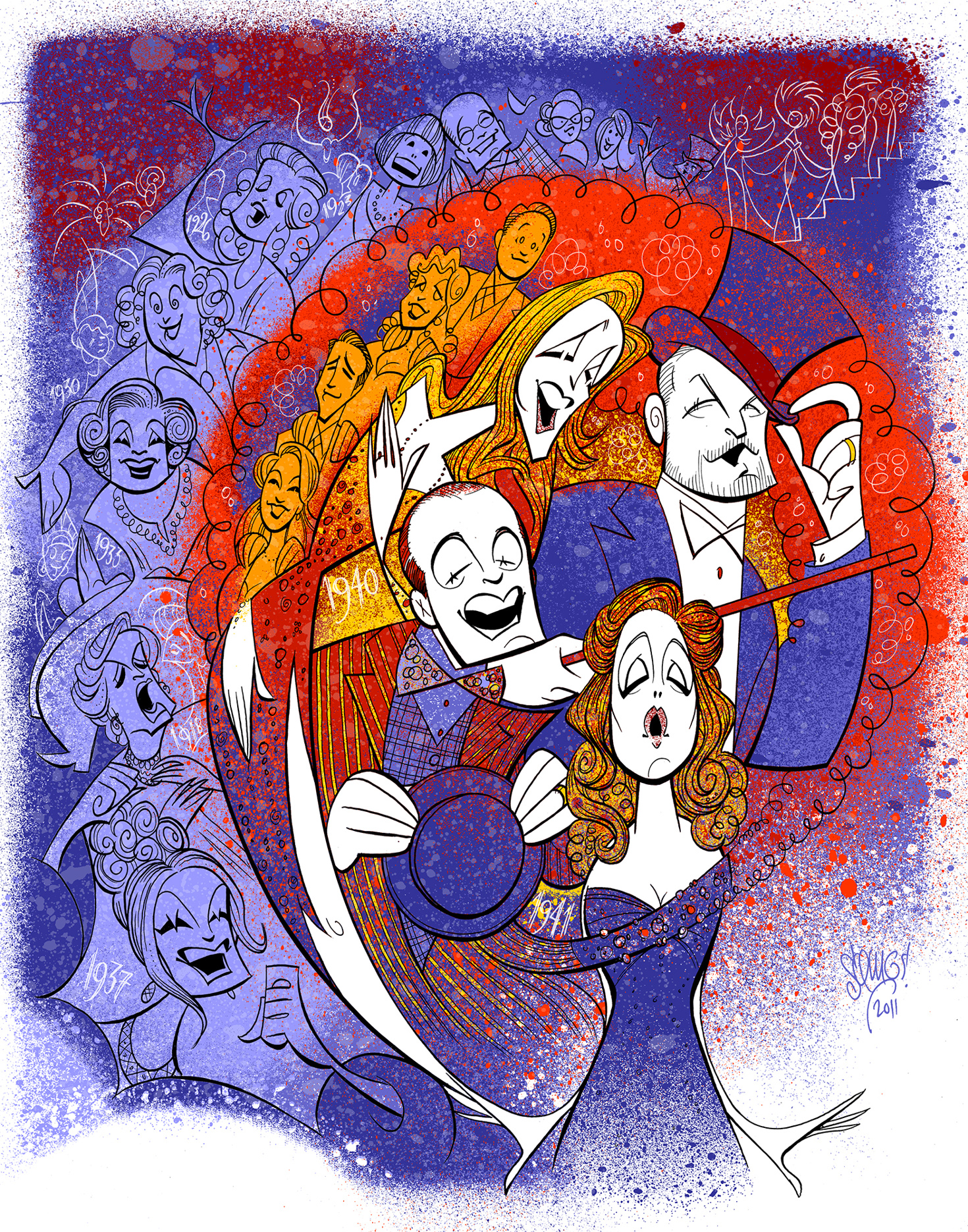
Follies (2011)
I’m a Sondheim nut. I was falling in love with his work around the time that I was discovering the world of theatrical caricature, including the illustrations of the legendary Al Hirschfeld. Here, I think I was successful at representing the vast cast while emphasizing the central relationships of Follies. And the color experimentation here was surprising yet satisfying.
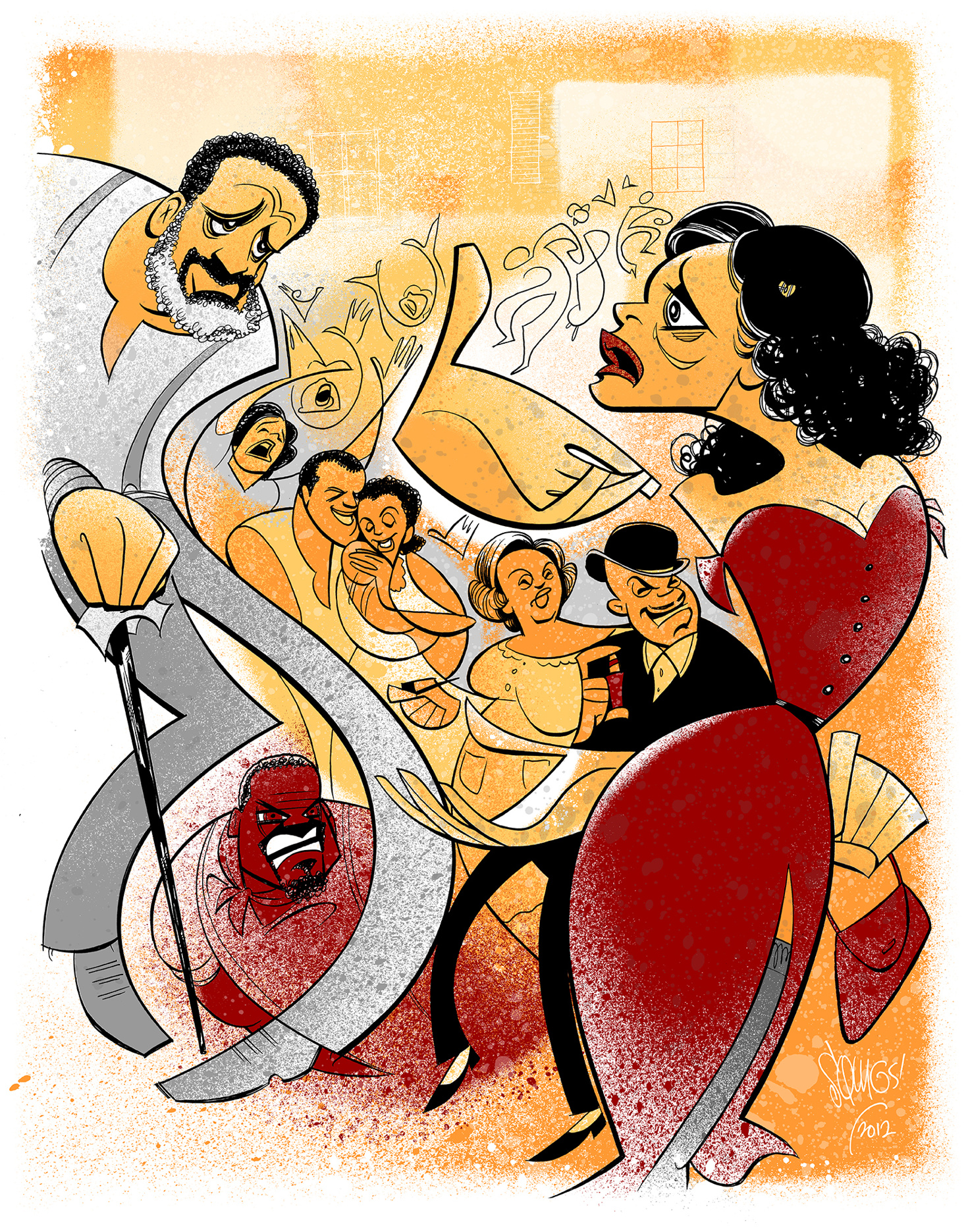
Porgy and Bess (2012)
Sometimes the most memorable moments of an epic show can hinge on a single, simple gesture which can then inspire the whole layout of my illustration. When illustrating Porgy and Bess, I hoped to convey the power of Norm Lewis’s Porgy with his hand outstretched to Audra McDonald’s Bess across the stage.
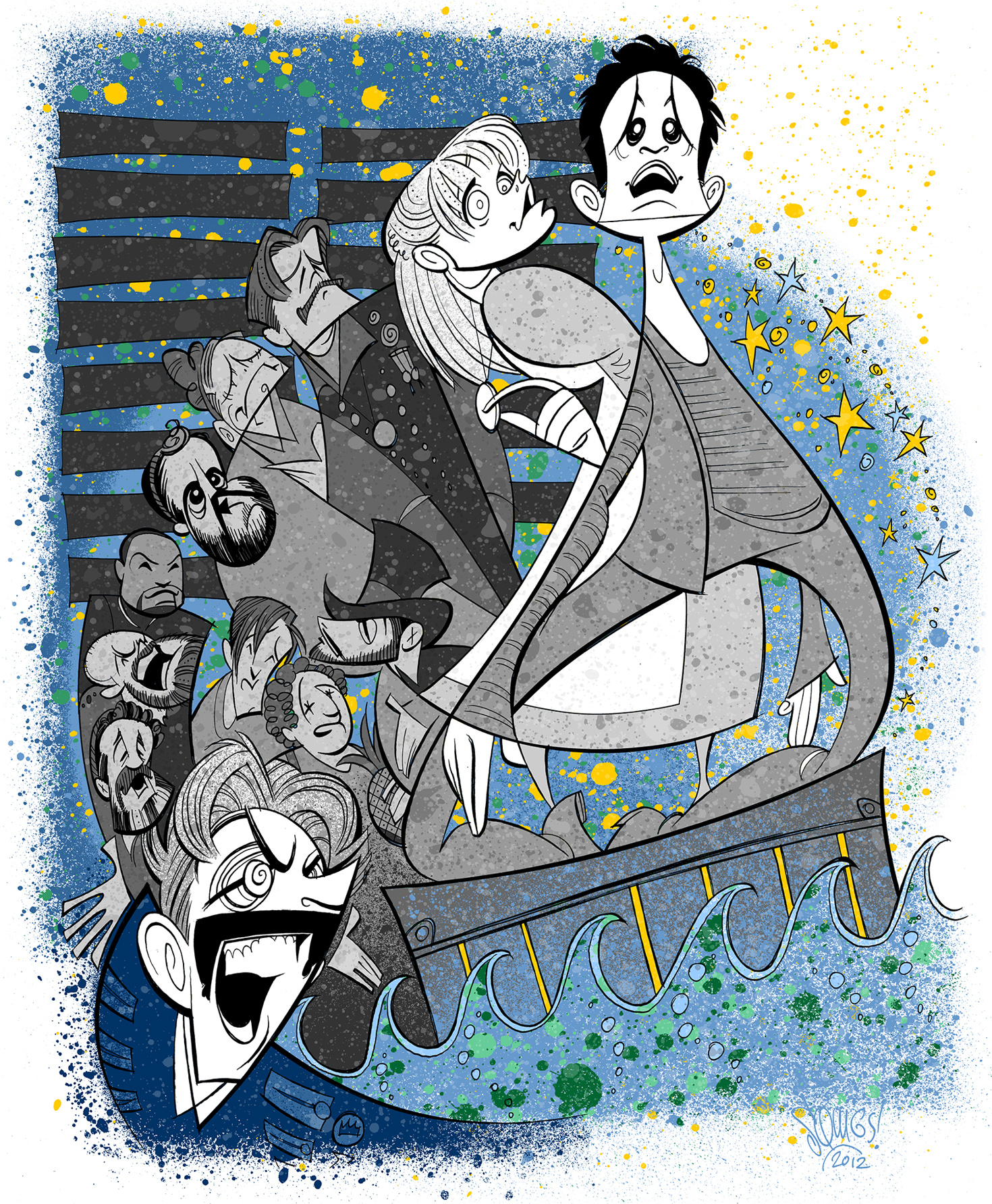
Peter and the Starcatcher (2012)
My illustration vocation sprang from drawing the casts of shows I’d performed in, so I always enjoy capturing ensembles of actors. In the case of this piece, it shows a swoop of personalities anchored by Christian Borle’s Black Stache (a bit shark-like here) sailing through Celia Keenan-Bolger’s wise Molly and Adam Chanler-Berat’s naive Boy. Here, the blue color palette only gives way to the gold of the star stuff.
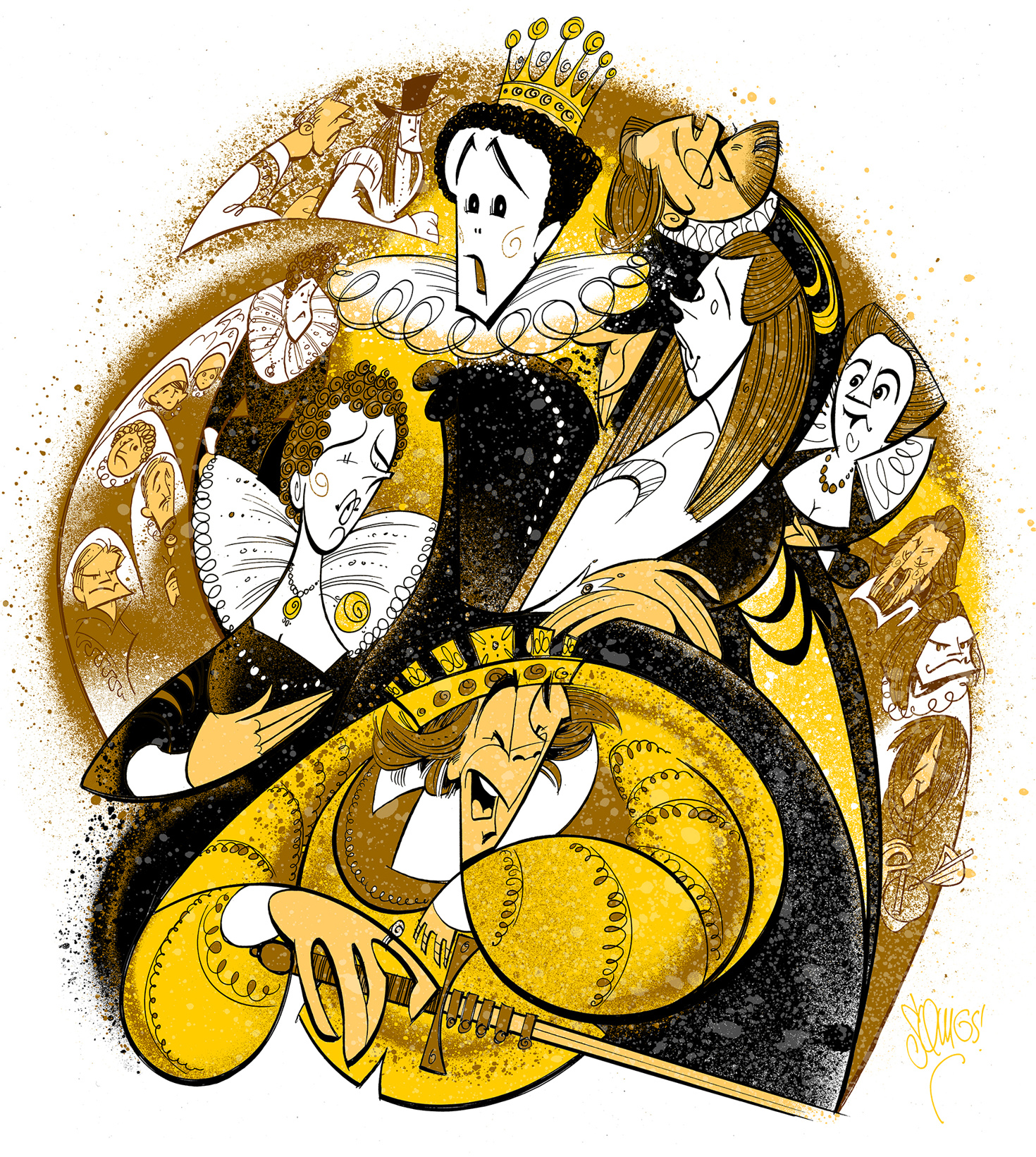
Twelfth Night/Richard III (2013)
I sometimes get asked to combine two different plays into one illustration. This is perhaps my favorite example of that kind of work: The thrilling Mark Rylance and company in two very different Shakespeare plays. It’s an early example of me representing various supporting players using color lines (instead of stark black) to anchor them more into the overall composition. This production felt like gold so that’s the palette I chose.
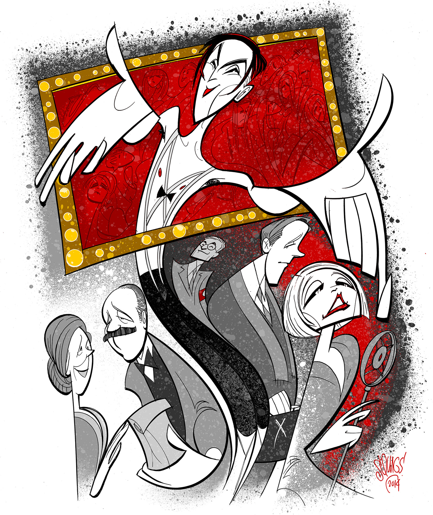
Cabaret (2014)
I often push the scale in my compositions, drawing some characters abnormally larger to symbolize their oversized presence in the story. Here’s an example featuring Alan Cumming’s Emcee beckoning us into the Kit Kat Club. I also represented the club portions of the story in bold color and the outside events in more subdued tones. I typically have a rule of not revealing plot twists that happen after intermission, but with a story as well-known as Cabaret, I thought a glimpse of the Nazism that comes later in the story was fair game.
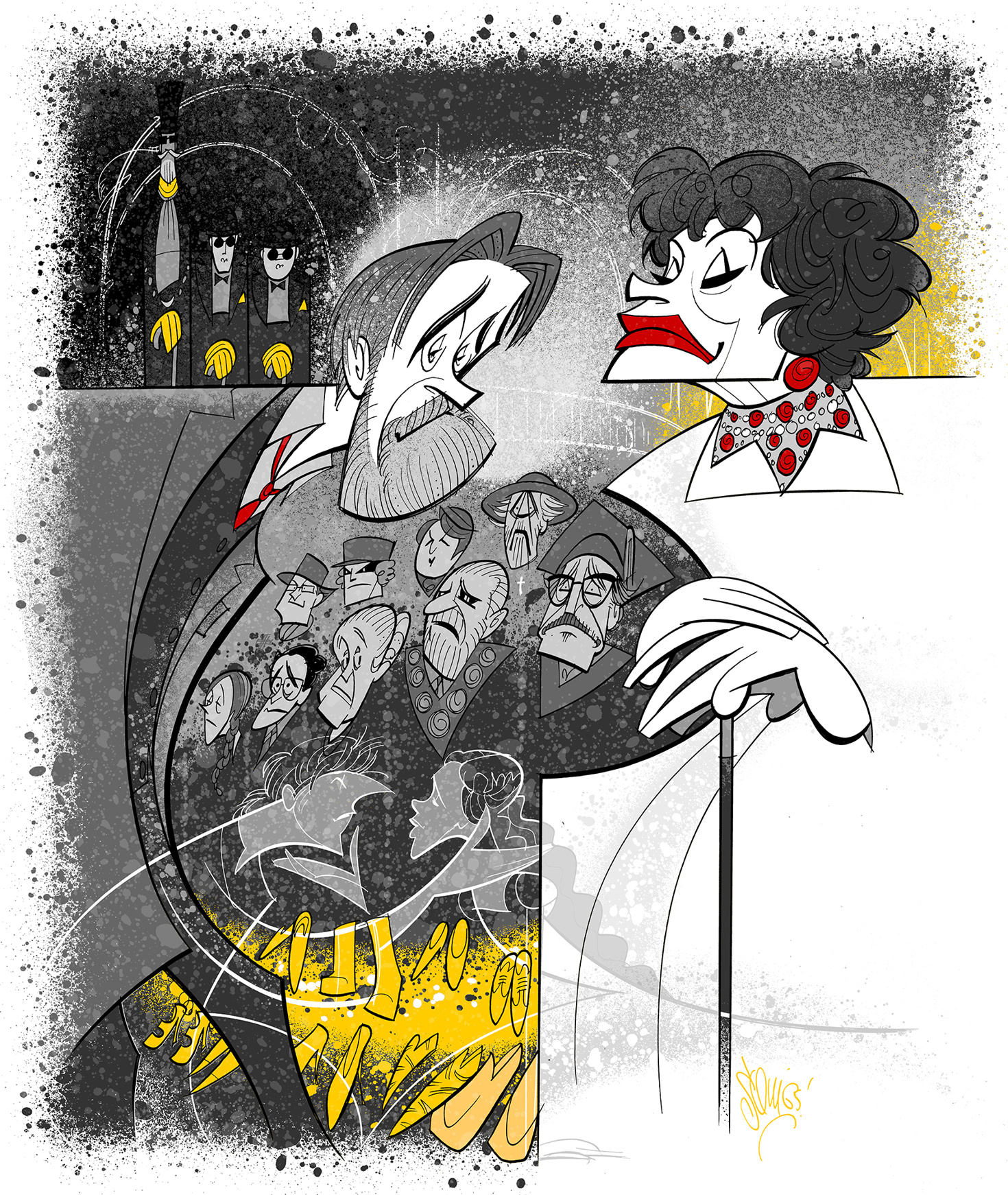
The Visit (2015)
In an otherwise drab black and white composition, the reds here represent the past connection between Roger Rees’ Anton and Chita Rivera’s Claire, while the yellows proclaim Claire’s return to town and her effect on the residents. I draw so much inspiration from the design team of each show, and here is a good example of their color choices making a big impact on my sketch. Also, in remembering this show, I’m reminded of the passage of time, of dearly missing what once was and appreciating what we still have.
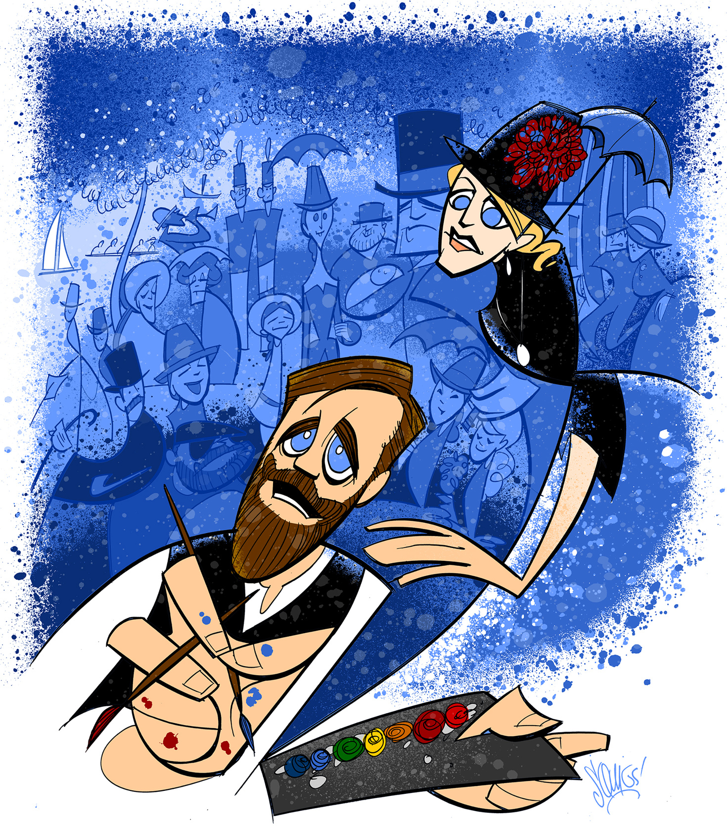
Sunday in the Park with George (2017)
Being a big ol’ Sondheim nerd and a visual artist, the lines crossed beautifully for me in Sunday in the Park with George. This piece is an early example of me representing a broad, somewhat-realistic range of skin tones. While a full-color approach makes the central couple pop, the blue background composition celebrates the full cast. The blue may be a departure from the original Seurat painting, but my stylistic motif of manipulated ink splatters was a somewhat effective surrogate for Seurat’s calculated pointillistic strokes.
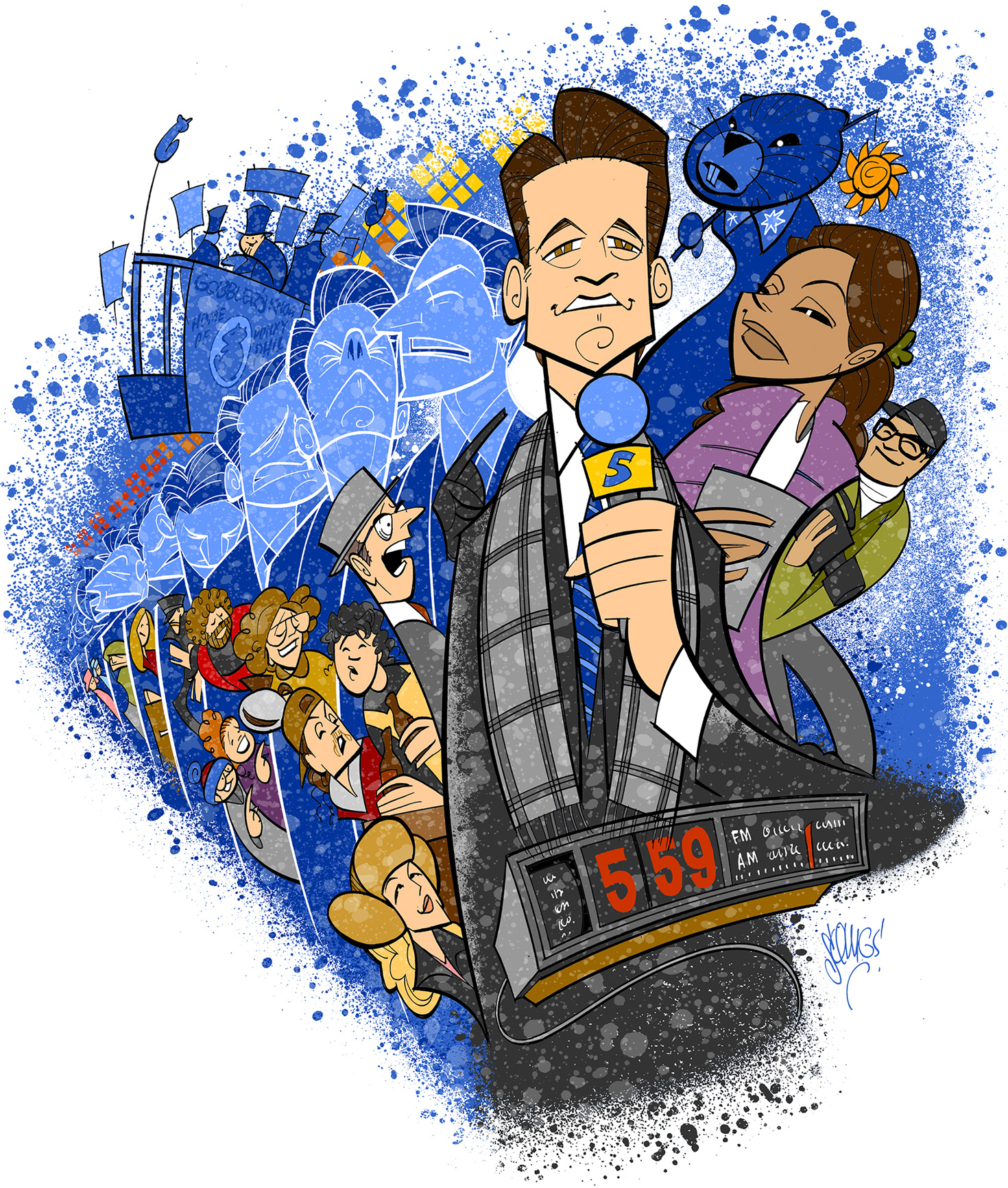
Groundhog Day (2017)
I love Groundhog Day; I’m a big fan of the movie and an even bigger fan of the musical. As is the case with many shows I’m passionate about, I may have overstuffed this one. But I think it works. There’s Andy Karl’s Phil Connors in an endless loop with various versions of himself, and the people of Punxsutawney peeking out from varied fractals in the cycle. There’s also the cozy windows of the town set, the sun, Gobbler’s Knob, Phil the Groundhog…well, I did overstuff this one, but it makes me happy.
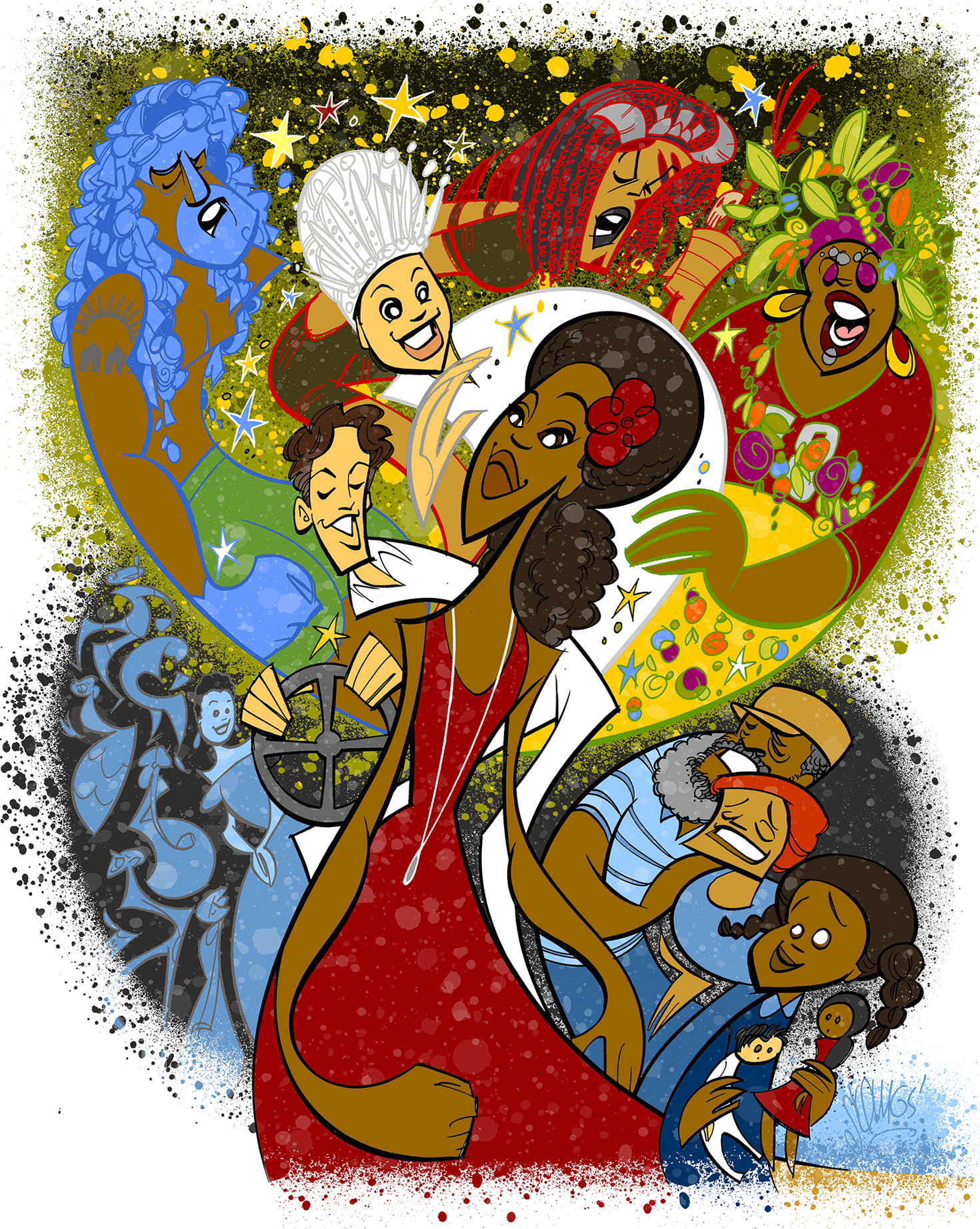
Once on This Island (2017)
One of my favorite things to represent in any illustration is the point of connection between two contrasting worlds. What better example of this than Once on This Island, where we see divisions between class and race, mortals and gods. I did my best to represent this concept in the dual color palettes, which come together visually to form a tree—a central symbol of the story. You can also see another stylistic evolution with my use of varied line colors for the central characters.
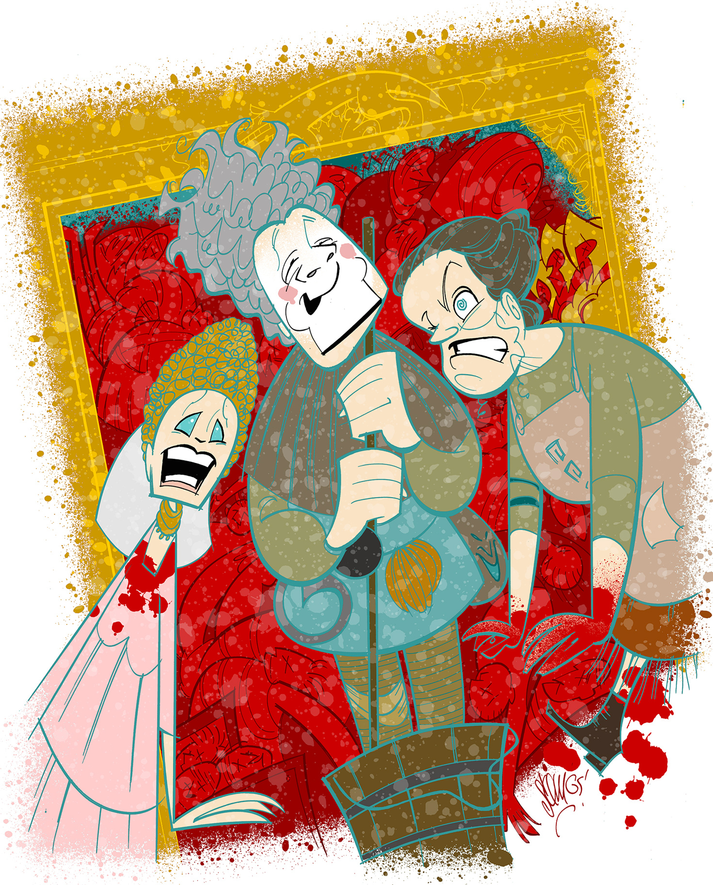
Gary: A Sequel to Titus Andronicus (2019)
Taylor Mac’s play was one of my favorites last season. The brilliant design team created a gilded world now besmirched by dead bodies and lots of blood (represented here by my collection of spatter templates). I contrasted the red and gold of death with the optimistic teal in Nathan Lane’s Gary. If I overstuffed this illustration, the overstuffing is necessary. Like Gary itself, there’s a lot of visual treasures to be found if you look closely. Reflecting the treasures that amazing collaborative artists regularly create in theater is hopefully a strength of mine; it’s definitely my calling.